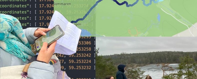
Visual representations of vast and complex arrays of data can change the way we understand and respond to everyday life. Interactive maps of the US presidential election, for example, have allowed us to track vote counting and predict potential outcomes in real time. Visualizations of changes in temperature over time in relation to the production of greenhouse gases and natural events have allowed us to understand human impacts on climate change and simulate potential future scenarios. Genomic data visualizations continuously help to unveil DNA mutations directly related to certain diseases. Using a hands-on approach, this course utilizes computational tools to transform raw data into interactive visual representations that are easy to access, understand, analyze, and reflect upon with the goal to provide insight and augment the cognitive capacity of both domain experts and lay people.
Related Discipline(s)
This course would also be of interest to the following discipline(s):Communication, Design, Engineering

